 |
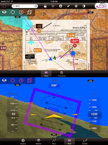
| Purple rectangles are common at altitude |
Seattle Avionics is actually one of my oldest clients and theirs are among the most complex WhirlyGlobe-Maply apps around. I've finally talked them into going public with their support for open source!
FlyQ EFB
For those of you unfamiliar with aviation terms (guilty) EFB stands for "Electronic Flight Bag."
Pilots used to haul a ton of paper charts around and do all sorts of complicated things with them. PCs and specialized devices replaced much of that and now commodity tablets are changing things again. Just like in other markets.
If you've ever wondered why WhirlyGlobe-Maply seems to have so many aviation-friendly features, now you know.
Maps, Globes, and True 3D
In FlyQ EFB WG-Maply is largely used as a map. Even though it's on a globe, everything is plastered to the surface and interactions are almost entirely map like.
.jpeg) |
| Don't let me anywhere near the controls of a plane. |
All of the objects you see on the globe are standard things like screen markers, labels, image layers and so forth. Organizing the data and passing it to WG-Maply is accomplished in the app, and I can assure you, that's the hard part.
 |
| Orange is bad. It's not orange's fault. |
There's also a true 3D mode which is meant to resemble what a pilot might actually see with certain caveats (Look out the window, fool). This is a little further afield of what WG-Maply is meant for and is tied much more tightly to their app.
Smart Plates & Charts
Seattle Avionics has another app called SmartPlates & Charts. Think of it as a simpler sibling to FlyQ EFB. If you're just curious, I'd start here.
It's great to be publicly welcoming Seattle Avionics to the open source family! If any of you other lurkers want to fess up, let me know.


